The Must-Haves On Your Company's Contact Us Page (With Examples)
Share
While buyers are typically 70% of the way to making a purchase before they reach out, you need to make it simple for them to get in touch when they're ready.
Think about it — your dream customer has made it to your website, read your blog posts, your company and product information, and maybe even downloaded some of your eBooks or product files, but when they're finally ready to reach out or submit an RFQ, you leave them hanging. Not the best experience, right?
Many companies focus attention on optimizing their home pages or information pages, which is great, but you want to make sure that the contact us page isn't overlooked, as it is one of the most valuable pages on your website.
In fact, it's one of the simplest quick fixes we recommend implementing for your manufacturing website. No need to stress if you don't have a stellar page set up, though, because we're here to help.
Best Practices For A Contact Us Page
Make Your Page Easy To Find
Having the perfect page isn’t just about its design or the elements you should include on it — it needs to get found.
If users can’t even find this page, how can you expect them to fill out a form and contact you when they are ready?
We recommend having a call-to-action in both the top navigation of your website in addition to the footer, and it doesn't hurt to include CTAs to your contact page in places like your about page or certifications page.
Include A Call-To-Action (CTA) On Your Site
We mentioned this in the section above, but it's so crucial we wanted to reiterate it here.
Many websites in the manufacturing and industrial space tend to stick forms on pages, which can look quite spammy or interrupt the flow of the design. We prefer using a mix of enticing CTA buttons across websites and blog posts (or on social media channels, as Facebook and Instagram both let you include them on your profile) and linking off to a dedicated contact page.
The form and CTA should work in tandem to fuel your industrial lead generation strategy, and ultimately, you're leading your prospects down the funnel from evaluating your business to contacting.
Whether that's a phone number, email address, or button at the bottom of your form, the prospect should be able to pick his or her preferred method clearly.
Incorporate SEO Strategy
Your website contact page can also elevate your search engine optimization strategy. By including keywords on this often high-traffic page, this will tell Google that it is a significant page.
Many industrial companies choose to diversify the content on their contact us page by including rich text, meta descriptions, images and maps. While doing so on website pages and blogs is best practice, something like a contact us page is often a missed opportunity to boost search rankings.
What To Include On Your Contact Us Page
Contact Us Form
This is a super obvious one, but we have seen many contact us pages without a form. Crazy, right?
Adding a form for prospects to fill out will not only guide them on how to present their problem to you more clearly, but it also helps you gather and organize the information internally to help solve their need. The form should be short, to the point and should avoid unnecessary fields or words to remain simple and easy to follow.
Interesting information for you — we've tested it, and we learned that left-aligned forms consistently outperform right-aligned forms.
Multiple Points Of Contact
Having an online contact form is a must, but it doesn't hurt to add your phone number, physical address, and email address so that customers and prospects can reach out through their preferred form of communication.
Not everyone likes to contact people in the same way, so providing options shows your company is flexible and works with users in a way that works for them the best.
Memorable Creative And Copy
Don’t be afraid to show visitors and potential customers what your business is made of before they even get in touch. Include engaging copy and imagery that entices them to contact you.
Some examples include:
- A customer quote that shows off how satisfied the customer is by partnering with you.
- A list of blogs or press releases that showcases your thought leadership and expertise in the industry.
- Relevant, simple imagery aligned to your brand and website design.
- A map of your location and physical address to boost SEO terms.
(Be sure to check out how a cold-root rolling manufacturer increased their Contact Us form submissions by 76% just by including a simple arrow!)
Industrial Contact Us Page Examples
Including A Map In-Page
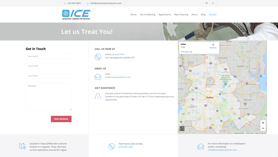
Interstate Carbonic Enterprises is a premier specialty dry ice blasting company, and the company's contact us page is clean, branded, and informative — and has a three-module approach, the page design is easy to follow.
ICE showcases multiple ways to get in touch, making it convenient for potential buyers to reach out — your contacts shouldn't have to work to contact you.
The company went the extra mile by including a value prop within this module, showing that they offer 24/7 assistance, which is an excellent example of using language to show value.
Reinforce Trust & Your Value Proposition
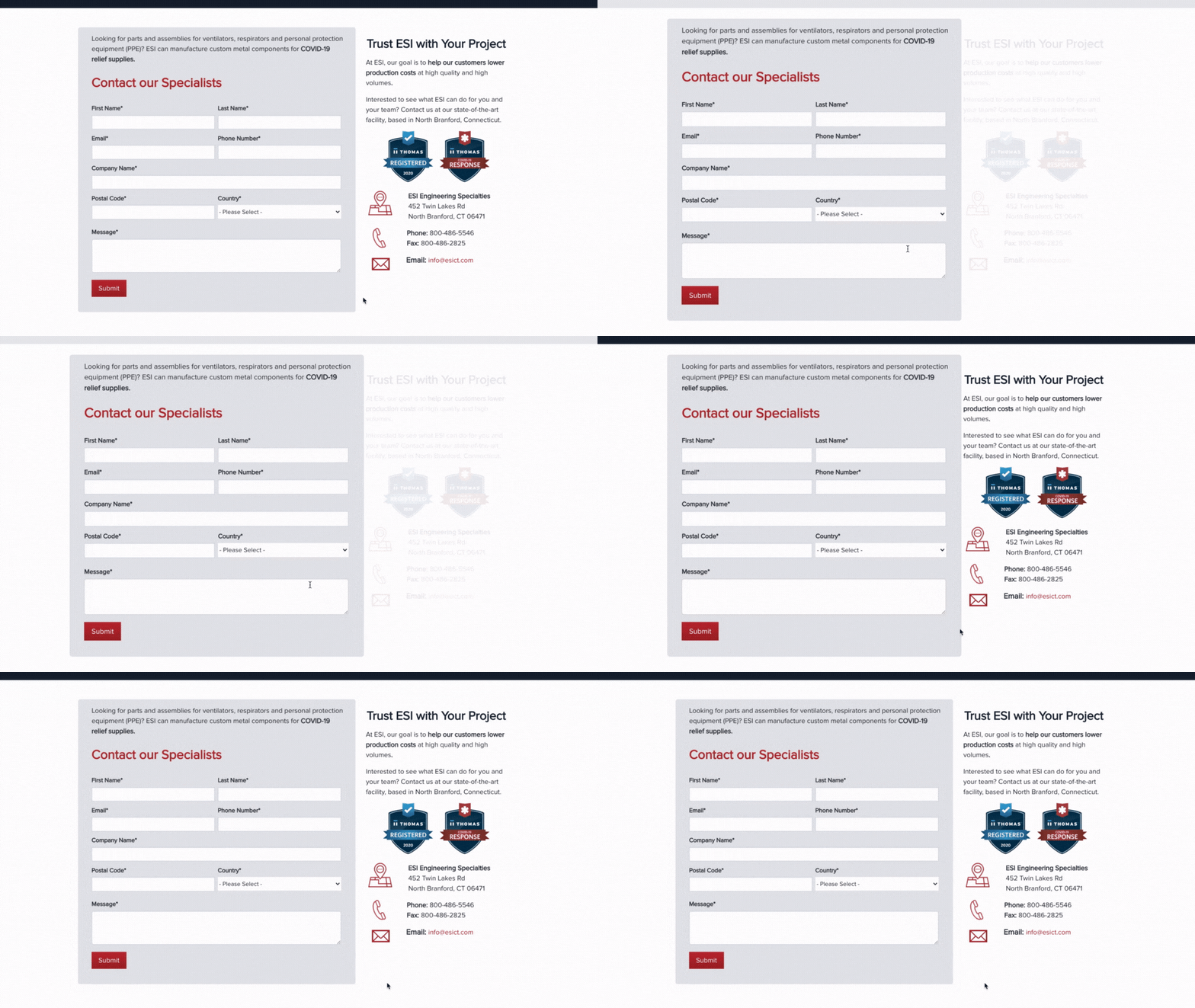
Engineering Specialties, Inc. is a metal stamping and automated assembly manufacturer, and their contact us page follows all best practices for design and elements — but what we'd like to highlight is the included content.
The H2 on the page —"Trust ESI With Your Project" — emphasizes that ESI is a reputable and trusted company to partner with.
With the help of Thomas Marketing Services, ESI implemented a "form focus" on this page, which is an effect that is triggered by mouse movement. This means that the form is the focal point and helps increase submissions and lead generation efforts.![]()
Clean Design That's Easy To Navigate
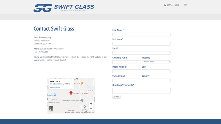
Swift Glass is a custom glass fabrication manufacturer and utilizes website design best practices on their contact page, which has a minimalist design that places all the attention on the form.
We want to spotlight here that this particular contact page doesn't have a top-bar navigation. Most of the time, we want to include a global navigation bar, so it's easy for prospects to maneuver around your website, but on a landing page with a form, you want all the focus to remain on contacting you instead of derailing to another part of your site — or worse, off your website to a competitor.
How To Engage After Someone Fills Out A Contact Form
It's simple — create a thank you page!
After the prospect submits the form, it should connect to a simple thank you page. This is often overlooked, but it assures the person reaching out that their request is on its way to your inbox.
Give your industrial leads an expectation as to when you'll be touch, and of course, thank them for submitting the form. It can also serve as a landing page to direct prospects to other useful content and resources, just include them below your messaging.
Learn More Best Practices For Your Web Pages
No matter who your customers are or what your buyer personas are like, every business in every industry should strive for a great and actionable contact page. Remember, this is one of the first steps the prospect will take to get to know you better — first impressions matter in website design.
A well-thought industrial website design and layout that clearly guides your visitors through their customer buying journey is the start of a great business relationship — so take advantage of these tips to optimize your contact page.
Still need some help? Sign up for our free Digital Health Check to get your entire digital presence reviewed by our experts.


