11 Best Industrial Website Design Examples
Share
A great website can be one of your best marketing tools helping to attract prospects, establish trust, capture leads, and ultimately win new business.
Buyers want to learn about your company, products, and services even before they reach out, which is why it's important to have an up-to-date place that has all of your information readily available. (Additionally, according to a recent industrial survey, website usage increased significantly year over year by manufacturers and industrial companies connecting with more buyers and customers!)
At Thomas, we’ve helped build and optimize more than 5,000 sites for manufacturers and industrial companies, so we know what works. To give you some examples to check out, we've put together a list of some of the best manufacturing and industrial websites that build relationships with visitors and turn them into customers.
Manufacturing Company Website Designs For Inspiration
1. American Alloy Fabricators
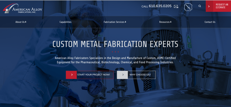
American Alloy Fabricators is an ASME-certified manufacturer located just outside of Philadelphia, Pennsylvania, serving the Pharmaceutical, Biotech, and Chemical Processing industries and offering complete custom fabrication services.
Their homepage immediately displays their ASME certification — something that buyers look for. We also love how it features a unique but clear CTA: “Start Your Project Now!” It gives the user insight into exactly what their next step is when they click the link.
American Alloy’s site has very intuitive navigation, so prospects can quickly and easily get where they need to go. Their resources section features a blog that helps solidify American Alloy as a thought leader by answering common questions. We also love that their website design and colors are a perfect match of their brand.
2. Tex Tech Industries
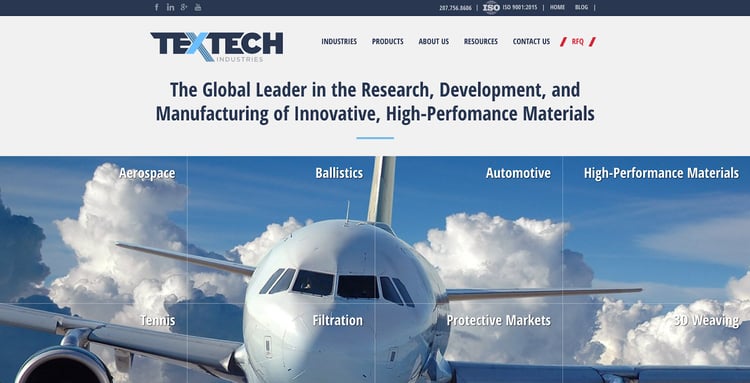
Tex Tech Industries is a leader in research, development, and manufacturing of innovative, high-performance materials — and their website truly exemplifies this messaging.
Their industry-specific pages are data-rich — and are filled with videos and unique interactive graphics that really showcase the value of their materials, the diverse markets they serve, and the unique cases they solve. Most of all, the quality of their website design instills trust.
"Diversified content on our site has really helped us stand out as a leader in the industry," said Eoin Lynch, Executive Director of Sales and Marketing at Tex Tech Industries. "Some aerospace technology can be complex, but our graphics, data sheets, and videos from Thomas Marketing Services break it down for buyers to understand what they need and how we help them."
See Examples: 10 Content Marketing Ideas That Engage B2B Prospects
Manufacturing buyers, engineers, and procurement managers are technical and sophisticated. As you redesign your website, make sure your marketing efforts reflect this. They seek quality and trust, so your website should portray the same.
3. Dedicated Computing
Dedicated Computing is an original design manufacturer of highly engineered computing systems for OEM customers, primarily within the healthcare, life sciences, training and simulation, and industrial markets.
Dedicated Computing offers very complex solutions, but everything on their site is simple and straightforward. The title text on the homepage sums up what they do perfectly, with a subtle hint of branding thrown in as well.
The module used for the “DC Spotlight” is a great use of real estate at the bottom of the home page. Featuring a company blog or news section on a homepage is a good way to boost traffic and viewership of the organic areas of your site.
4. Lockheed Martin Corporation
Lockheed Martin is an aerospace, defense, security, and advanced technologies company — you probably already knew that. But what you probably didn’t know is that Lockheed Martin is also a great storyteller. In fact, they’ve made their blog — not their products or services — a focal point of their site, so when you land on the homepage and begin to scroll, you can’t help but engage with these articles.
Thomas Tip: Get ahead of competitors by comparing your website against theirs. Thomas offers free digital health checks for manufacturers and industrial distributors who want to better understand how their digital marketing efforts are performing and which areas they can improve.
"We tried other people with our website and marketing but found their focus wasn't on manufacturing, and Thomas is. We get a lot of activity now and steady results weekly — a lot of inquiries thanks to Thomas and our online marketing efforts," Ron Delfini, President at Engineering Specialties, Inc.
While a blog is the heart of any content strategy, many companies view it as an afterthought. By featuring the blog content so prominently on their site, Lockheed is leveraging its content to highlight their expertise and innovations, while building relationships with visitors and converting them into leads.
Lockheed Martin's website content is extensive. Video is utilized strategically across Lockheed Marin's website, which helps diversify the content and engage with visitors who prefer visuals over reading content. Lockheed Martin's dedication to innovation and quality is reflected across its website and videos help break down the company history and mission. There's no shortage of information for any type of website visitor.

5. Glauber Equipment Packaging
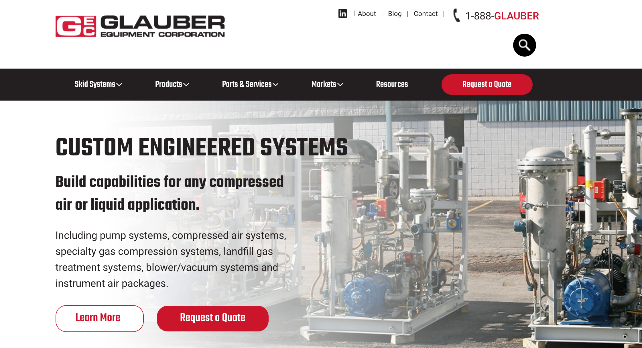
Glauber Equipment Corporation designs and builds custom fabricated skid systems, pump systems, compressed air systems, landfill gas treatment systems, and more.
The first thing you’ll notice about the Glauber site design is its use of color. The smart use of white space evokes a minimalist, clean design, and allows the accented, branded red to stand out — that “Request A Quote” button just screams, “click here."
Below the fold is a large “products” module, which is easily navigable and allows users to learn more about the company’s offerings without even touching the navigation menu. While many sites employ a market or industries module on the homepage, Glauber’s execution is unique. Their website has a module that uses an “accordion tab,” and when you hover over an icon, a corresponding CTA and description appear. It’s a good way to limit overloading visitors with CTA buttons while still making it easy to get to the right place.
Related: CTA, CTR, and More — The Essential Dictionary of Industrial Marketing Terms
6. M3 Glass Technologies
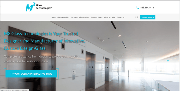
M3 Glass Technologies is a global leader in producing and shipping custom fabricated glass products. This family-owned company is now on its third generation of owners and has evolved each decade since the 1950s up-to-the digital age of today.
There are a few key features to note on the M3 homepage, starting with the CTA that is above the fold. What makes this CTA special? It draws the reader in with its popping brand color, its hover animation, and the simple design around the CTA that draws viewers in to click.
Something else that the M3 Glass site does well that more manufacturers are utilizing is video marketing. Not only is video one of the top mediums for marketing but using testimonials and videos are a great way to showcase to your customers how you can help them from your customers' perspective.
7. Plex
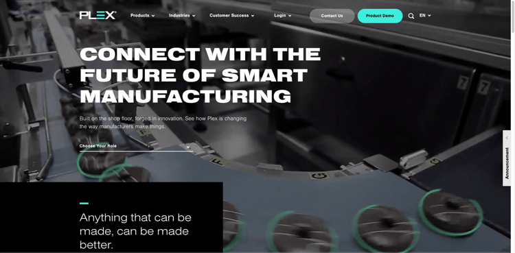
Plex is an ERP manufacturing software that connects manufacturing operations in a cloud to provide visibility and control over manufacturing processes. It should come as no surprise that a software solution company website uses a cutting-edge website design.
Plex incorporates videos in their header instead of one traditional hero image, which effectively draws users in and catches their attention. Multiple CTAs (Get The Report, Read More, Product Demo, etc.) help increase online submissions.
We love that their homepage header gives visitors the option to choose who they are, "Supply Chain Leader," "CEO," "Quality Manager," etc. to tailor the website content for their needs. According to BCG, brands that create personalized experiences by integrating advanced digital technologies and proprietary data for customers see revenue increase by 6% to 10%.
Manufacturers and industrial companies looking to connect with more buyers online should note how important it is to understand who their buyers are. This is called persona targeting — when you take the time to compile data about your key targets and organize it, you can more easily create the right content to reach your audience.
Learn More: The 3 B2B Personas That Influence The Buying Process
8. Mac Instruments
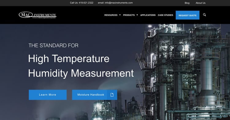
Mac Instruments manufactures industrial instruments. With a focus on moisture analyzers and flow meters, Mac Instruments is a world leader in high-temperature moisture measurement in industrial processes.
The Mac Instruments website stands out thanks to a dark, bold theme. Each product page features a lot of in-depth information, including data sheets, handbooks, wiring information and more. Having a lot of valuable content like this on site pages can have a huge impact on search engine optimization and usability.
Another great feature that Mac Instruments utilizes is a “Back To Top” CTA, which provides an easy user experience for their audience to get back to the top of the webpage.
9. Mattei
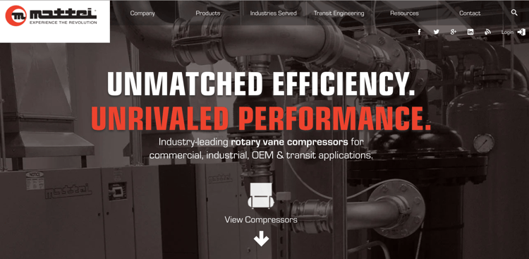
In 1958, Mattei developed the rotary vane compressor and since then, these machines have been used worldwide in nearly every industry and market. Let’s face it, first impressions are everything. You have about seven seconds to grab a visitor's attention before they potentially navigate away from your manufacturing website. With that in mind, Mattei certainly does a great job of catching your attention. The first thing you’ll notice is that the homepage has some simple, yet effective animations for the homepage copy, images, and navigation bar.
The combination of the language used and the dual-toned headers paint a picture that is bold, attention-grabbing, and authoritative. By displaying images of Mattei products, there is a clear understanding of what the company offers — product images are one of the criteria buyers use to evaluate them. Throughout Mattei's website is SEO-rich, professionally written copy to provide great detail about their capabilities and the industries they serve — while boosting their visibility in searches.
10. Dehumidifier Corp
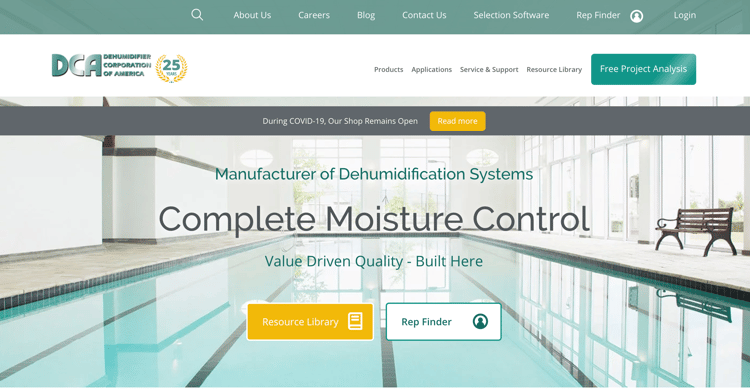
Dehumidifier Corp does just about everything when it comes to dehumidifiers. The products they offer vary from dehumidifiers, control systems, condensers, and duct heaters serving a wide range of industries.
What makes this site stand out can't be seen with the naked eye, but happens behind the scenes. The company utilizes A/B testing to drive continuous improvement and ensure that its site is always being optimized. A/B testing is a component of Growth-Driven Design (GDD), which is a more analytical and data-driven approach to website design and development. Unlike traditional web design, GDD focuses on iterative testing and improvements, capturing visitor behavior, and making decisions fueled by actionable data to convert traffic to leads— not gut instinct.
 11. Manor Tool & Manufacturing
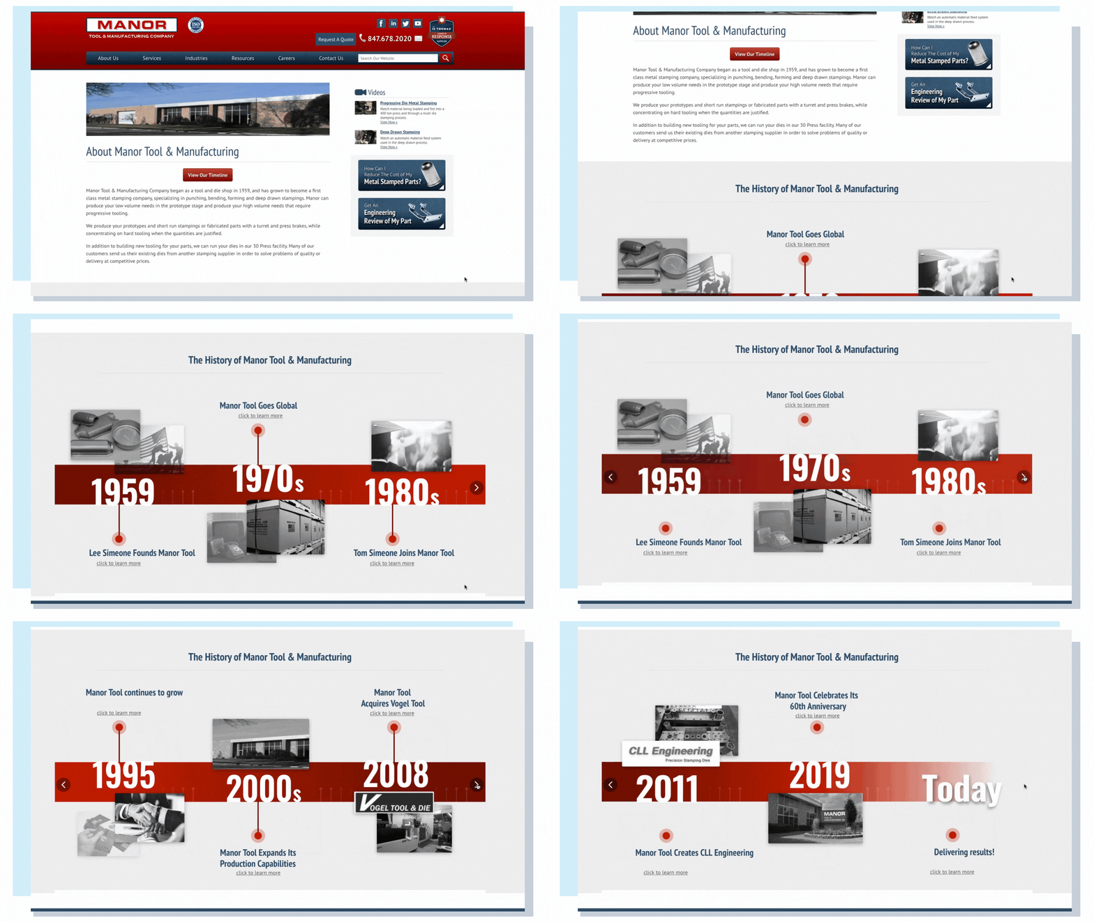
Manor Tool is a metal stamping company, specializing in punching, bending, forming and deep drawn stampings — but in 1959, they began as a tool and die shop. To present the growth, history, and innovation of their company, Manor Tool incorporated an interactive timeline on their About Us page.
See More Examples: About Us Page Website Examples For Manufacturers
Manufacturing And Industrial Website Design Must-Haves
Everything on your website — images, content, navigation, and other website basic elements — needs to be customized specifically to your audience and your industry if you want it to work as a lead generation tool.
With that in mind, there are definitely certain traits that all great websites have in common and that your website needs to be successful such as:
- Clean Design
- Branded Elements
- Prominent Logo
- Mobile Responsive
- Intuitive Navigation
- Easy-To-Use-Forms
- HTTPS Encryption
- A Contact Us Page
- Great Content
A truly effective website gets found online, engages visitors, and encourages them to submit a form to be contacted.
Want to take the next step? We offer free Digital Health Check for industrial companies and manufacturers to see exactly how you can optimize and improve your website.


