10 Signs Your Manufacturing Website Is Out Of Date
Share
It used to be that simply having a website would set you apart from the competition. You could create a handful of pages, add a little background about the company, sprinkle in some images, set it, and forget it.
But today's world is more digitally connected than ever and if you want your website to be a lead generator, it requires a lot more upkeep—because today, users expect more.
Thus, manufacturers and industrial companies are investing in website efforts because it is proven as a key driver of new business and the centerpiece of growth and digital marketing efforts.
If you're worried that your website isn’t hitting the mark, check read below for ten easy ways to determine if your site needs an upgrade.
1. You Haven't Added New Content In More Than A Month
Google looks for freshness when it re-crawls a site. It likes to see that a website is growing with new pages and blog posts — and prioritizes search rankings accordingly. So you need to post regularly!
You don’t have to hit a ridiculous posting quota to be noticed — even as little as once a month will demonstrate that you are maintaining the site and updating it consistently.
Not only does putting out fresh content your buyers are looking for — in the form of blogs, eBooks, checklists, white papers, calculators, product specs, and so on — position you as a cutting-edge, insightful, and directly helpful thought leader, it also helps you get noticed.
2. You Can't Remember The Last Time You Updated Your Homepage
Your homepage is where visitors will get their first impression of your business. No matter how great the products or services you offer are, if site visitors exit right off your homepage, you might as well consider it lost business.
Having intuitive navigation and homepage design is a must-have on your industrial website. If you don't have a clear, and organized site structure, users won't easily get to where they need to go (aka they won't be able to request a quote, or even get to your product specs).
Oh, and while you're at it, make sure your footer is up-to-date as well. It seems like a small detail, but it's off-putting to look at the bottom on your pages and see "© 2009."
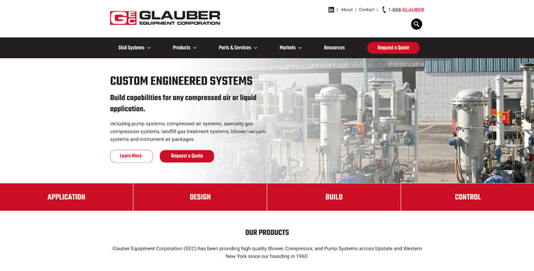
Want a good example of what to do? Take Glauber Equipment Corporation for example. They do a great job guiding site visitors across their site, and once you're there, the first thing you’ll notice about the Glauber site design is its use of color. The smart use of white space evokes a minimalist, clean design, and allows the accented, branded red to stand out — that “Request A Quote” button just screams, “click here.”

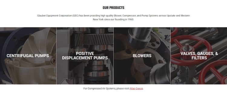
Below the fold of Glauber Equipment's website is a large “products” module, which is easily navigable and allows users to learn more about its offerings without even touching the navigation menu. 
Lastly, while many sites employ a market or industries module on the homepage, Glauber’s execution is unique. Their module uses an “accordion tab,” and when you hover over an icon, a corresponding CTA and description appear on the left. It’s a good way to limit overloading visitors with CTA buttons while still making it easy to get to the right place.

3. You Can't View Your Website Correctly On Your Phone
We've been talking about whether manufacturers need a responsive website design for years — and the short answer is YES.
There are all sorts of new features web developers are A/B testing every day to enhance user experience but, before you try anything else, a responsive design should be at the top of your list. To accommodate the growing number of users browsing the web from their phones and other devices, this feature enables a site’s layout to adjust to any size screen automatically.
About a decade ago, it was fine to have a "desktop" version of the site in addition to a "mobile" one, but the industry standards (along with screen sizes) have changed.
Today, users aren’t just accessing brand and product information from their computers — they’re also using tablets, smartphones, and other mobile devices to search for products, gather specs, and compare pricing.
Procurement managers are increasingly choosing to self-educate online rather than call different companies, so it’s critical to offer useful content and product information that can be accessed on the go. Plus, websites that don’t automatically resize for mobile devices don't perform as well on Google.
4. You Are Unaware Of Google's Latest Algorithm Change
On that note, Google continuously rolls out algorithm changes, which can determine which websites show up first when buyers and consumers search the web for the products and services they need. It's important to continue following all best practices for website design to give your company the best chance at getting found.
If you're uncertain about the state of your digital home, we can provide a free website audit to make sure B2B buyers can still see your website above competitors. Manufacturers who are up to date on the latest marketing and technology changes created a plan earlier this year to address:
- Site security
- Page speed improvements
- Mobile-friendliness
- User experience
To help you create a fast, effective game plan to stay on top of ever-changing digital best practices, Thomas offers a free Digital Health Check. We'll score your website against competitors and let you know which areas your website is performing best in and how you can improve.
5. You Don't Regularly Check On The Performance Of Your Website
Like your manufacturing operations, websites shouldn’t be static entities — a focus on constant improvement requires consistent testing and analysis. Just as your production processes and services update as time goes on, technology changes too and makes websites out of date.
Luckily many technologies and software can easily track user activity, allowing companies to see how visitors interact with their sites, conduct A/B tests to determine which kinds of phrasing or designs are more appealing to visitors, and make ongoing updates based on collected data.
We recommend you take a look at your website analytics regularly to see how it's performing and visitors are interacting with your assets — read more about the 26 Must-Have Digital Marketing Apps And Tools here.
6. You See A "Not Secure" Notification On Your Web Browser
Your customers and prospects take their security and privacy very seriously when browsing online, and you need to ensure that you are meeting their expectations. Having "HTTPS" in your address instead of "HTTP" can help safeguard against cyberattacks and fraud, while providing your visitors with a better user experience and greater peace of mind.
A secure, encrypted site can also help you rank higher in search results and keep your company data secure for your employees and overall business.
Learn More: Information Technology Challenges In The Manufacturing Industry
7. Your Images And Font Look Like Clip Art
If you haven't updated your website in a few years, it’s likely time to reevaluate your image, font, and general style choices. Flashy, large fonts that were the style years ago are hard to read are just as bad as tiny, illegible fonts. Stick to classic, easy-to-read fonts that look modern but not showy, and take stock of your images.
Do they accurately speak to your brand, or were they chosen quickly years ago without much thought? Images speak volumes about a company’s “personality” and professionalism, so it’s important to choose graphics and site designs that get across the right message.
8. Your Website Doesn't Have An Effective Online Product Catalog
If you're a manufacturer, OEM, or distributor your website must include an up-to-date, easy-to-use, online product catalog. We're not talking about a PDF download of all the products your company has to offer. With the shift to direct to consumer selling it's becoming more and more important to provide your buyers and especially engineers with digital product catalogs to see what your shop has to offer, product specs and make online purchases easier.
Trust us, you don't want to run the risk of a potential buyer navigating away from your website to your competitor because they couldn't figure out how to submit an RFQ or RFI. Let your website be your most reliable sales channel.
Online product catalog best practices and additions include:
-
- Ability to submit RFQs using forms to capture their information effectively
- Allow for the immediate purchase of short-sales cycle commodity products
- Compare-and-contrast feature
- Advanced search and configuration capabilities
9. You're Not Seeing Any Leads Coming From Your Website
If you do not see any leads from your website landing pages, it may have to do with your website traffic taking a plunge or the quality of visitors. Carve out some time to do a technical audit of the site — that's why we mentioned earlier how important it is to track your efforts.
Is your website taking a long time for pages to load? Are there very large images? Are you using a low-quality hosting site? Are there lots of embedded media or browser plugins? All of these things can slow down page loading times and make for a frustrating user experience. People expect to move through your site quickly and intuitively, and if your site design prevents that from happening, users will move on to a competitor’s offerings.
Things like cheap hosting services, oversized images, inefficient code, embedded media, and browser plugins can all negatively impact load time — frustrating users and earning you a penalty from Google. Other factors such as internal 404 errors or broken outbound links can have the same effect.
You could also be experiencing a bounce rate issue. In other words, visitors are coming to your site and leaving without exploring any other pages. Google interprets a high bounce rate as a poor user experience and uses Google Analytics and Chrome tools to factor this into SEO value.
Your website should be one of your best lead generators. And to ensure your website forms and buttons are doing their job, it's very important to test and optimize your site for improvements continuously.

10. You're Relying On Gut Instinct When It Comes To Design Decisions
A/B testing is a component of Growth-Driven Design (GDD), a more analytical and data-driven approach to website design and development. Unlike traditional web design, GDD focuses on iterative testing and improvements, capturing visitor behavior, and making decisions fueled by actionable data.
Tests can range from changing up CTA colors to see higher click-through rates, form testing to see higher conversion rates, or anything you may want to shake up to see better business results.
See Examples:
- A/B Testing Website Examples That Get More Clicks
- 10 Best Industrial Website Designs For Inspiration In 2021
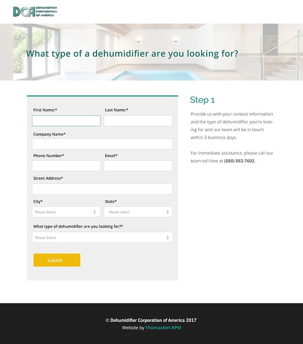
With the help of Thomas experts, Dehumidifier Corporation is a great example of an industrial business that consistently uses growth-driven design to drive continuous improvement and ensure that its site is always being optimized.
With a very high bounce rate on Dehumidifier Corp's RFQ landing page, we made updates to the page and saw an increase of 67% more leads with a multi-step form. Additionally, users were 28% more likely to interact with the RFQ page. Check out the full test here: How To Get 67% More Leads WIth Multi-Step Forms.

Managing Your Website Is A Continuous Effort
Taking the initial step to designing a high-quality, user-friendly website is essential for your company's growth. However, it’s just as important to keep your site up to date and modern to offer visitors the best possible user experience at all times.
Consistently updating your site based on tracked user activity, offering a mobile-friendly, modern design, and taking the time to perform technical assessments are just a few of the many ways to ensure you’re staying ahead of the curve.
What's Next? Review What To Update On Your Website With A Free Digital Health Check
Just as your middle school yearbook photo probably isn’t an accurate representation of who you are today, an outdated website isn’t likely to be a good representation of your company now. If a prospect visited your website today and then came to your facility tomorrow, would they wonder if this was the same company? If you’ve recently rebranded, added new products or services, or shifted your areas of focus, you’re definitely due for a tune-up.
As your business continues to grow, the content and images on your site should reflect all of the cutting-edge tools, technologies, and services you’re able to offer.


